

A beautiful website is only the start: structure, navigation and speed
Two real projects — Spideo and IPEspinho — showing how goals shape structure, mobile navigation and technical choices, without jargon.
A site can catch attention. What matters next is what happens after someone arrives.
I build websites with strategy, design and development. When someone asks me for “a beautiful site”, the first question I ask is different:
What needs to happen after someone enters your site?
Without that answer, design floats. With it, structure, navigation and even speed have a clear job.
Two journeys, two goals
I am not comparing which project is “better”. They are different businesses — and that changes the visitor’s path.
Spideo — exploring a complex product
At Spideo, the challenge is making a technology product easier to explore: understand the solutions, dig into information, and avoid getting lost in generic blocks.
The typical journey is not “fill a form in five seconds”. It is orientation: what this is, who it is for, which problems it solves, where to read more.
IPEspinho — understand the offer and move toward an application
At IPEspinho, the goal is different: organise the training offer and create a clear path to an application enquiry.
Here the visitor needs to understand courses, school context and the next step — without hunting for the right button across loose pages.
Headings, sections and calls to action
In both cases, design supports the journey — it does not replace it.
- Headings say what the section covers, without empty fluff.
- Sections separate ideas (product, proof, process, contact) so visitors do not mix everything.
- Navigation reduces “where am I?” and “where do I go?”.
- Calls to action point to the right next step for that business — explore more at Spideo; move toward an application at IPEspinho.
If you want to go deeper on platform choice (WordPress or something else), there is a separate article: WordPress or another solution (Portuguese). This piece stays on the journey.
On mobile, the path must stay obvious
Most visits arrive on a phone. If the menu hides what matters, the journey breaks.
At IPEspinho, the side menu and access to the application request were designed for that screen: visitors should be able to find the offer and move forward without guessing.
Speed — in plain language
A slow site wears people out. Pages that take long to open make many leave before reading what matters — especially on mobile.
Speed is not a technical trophy. It is respect for the time of someone who arrived with a question.
In PageSpeed Insights captures from 12 October 2026 (not a test run today), these were the values shown in the project material:
| Environment | Performance | Accessibility | Best practices | SEO |
|---|---|---|---|---|
| Desktop | 100/100 | 96 | 100 | 100 |
| Mobile | 94/100 | 100 | 100 | 100 |
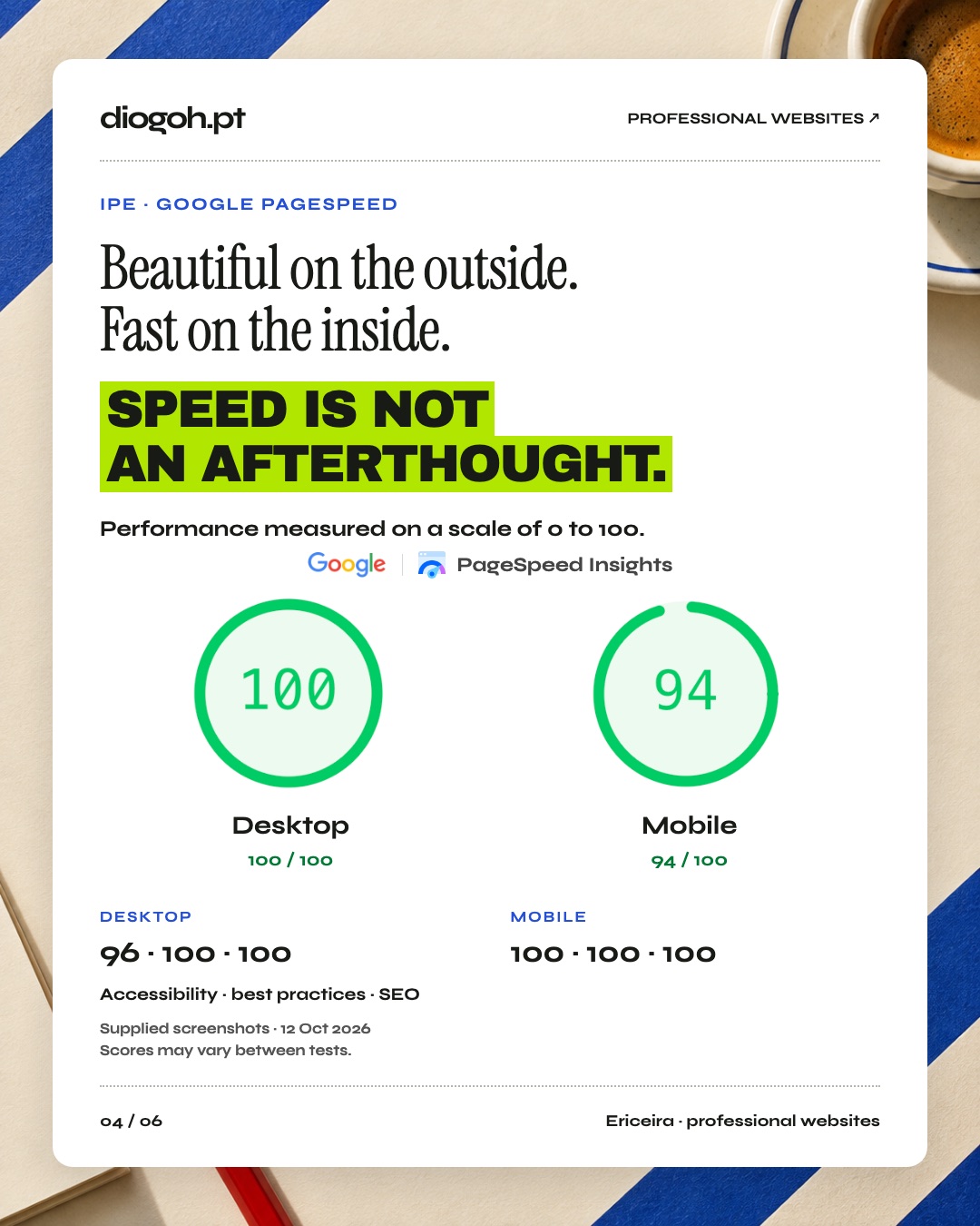
Source: historical captures supplied with the project carousel, dated 12 October 2026. Not a current measurement. Results may vary between tests and do not prove Google rankings.
Tools like PageSpeed measure lab conditions. They help spot obvious issues — they do not guarantee traffic.
Questions for your own site
- What do you want someone to do after they arrive?
- Is that step visible without endless scrolling?
- On mobile, does the menu help or get in the way?
- Do headings describe the content — or only decorate?
- Does the site open quickly enough for someone to bother reading?
If you are thinking about discovery through search and AI, site structure and clarity are the same foundation: useful information, accessible, in the right place.
Free review
Want a concrete look at your site? Request the free review: three practical improvements within 24–48 business hours, by email or WhatsApp.
Ready to take the next step?
Pick a plan, browse models for your industry, and request a proposal — reply within 24 hours.